Landing page review: what to fix first
Most landing pages don't fail on design. They fail because the visitor can't tell what it is, or can't find the next step. Check these before anything else.
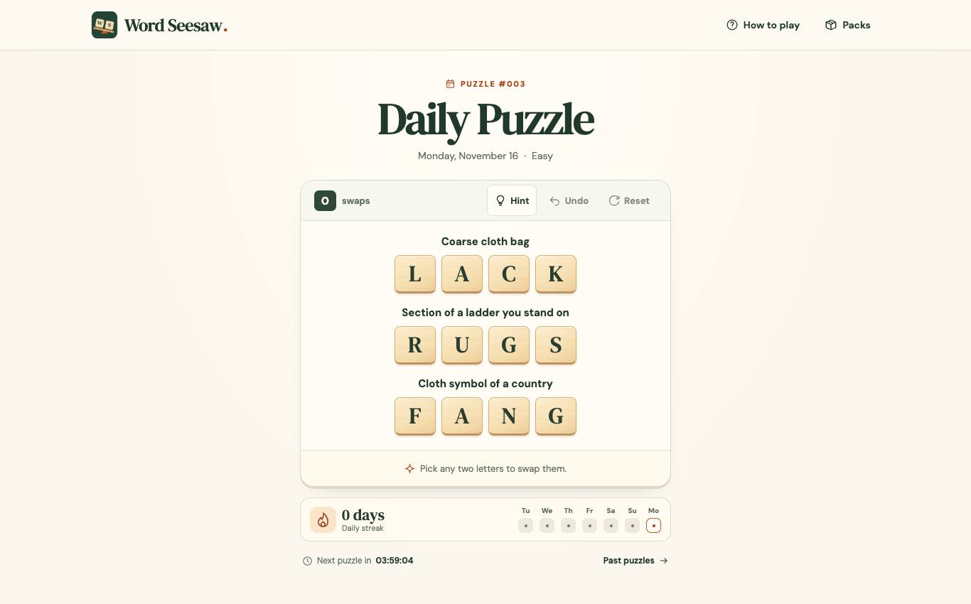
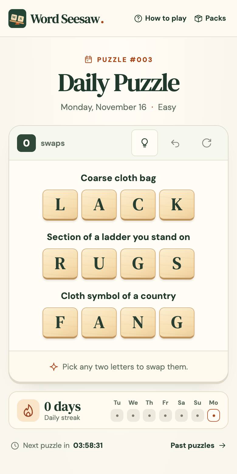
Check it yourself
Headline names the outcome
Say what the visitor gets, in their words. Clever slogans can wait.
The subheading answers 'for whom?'
Name the audience so the right people stay and the wrong ones leave early.
The button is visible without scrolling
On desktop and on a 390px-wide phone screen.
Proof sits near the claim
A screenshot, an example or a real number next to the promise it supports.
Questions are answered before they stop someone
Price, what happens after signup, how to cancel.
One page, one goal
Remove links that lead away from the main action, especially above the fold.
Or let ShipJury check it for you
- Three reviewers read your page as a first-time visitor, a skeptical buyer and a phone user.
- An editor keeps only what the screenshots support and ranks the fixes.
- Each fix comes as a task you can paste into your coding agent.
Questions
Can it review a single page?
Yes. Paste the landing page address and it starts there.
Will I get a score?
Yes, calculated from a fixed checklist of 25 checks shown in full in the report.
Is it a person reviewing?
No. It's an automated browser and AI reviewers, which is why it takes minutes and costs $19.