Test your website on a phone-sized screen
Resizing your desktop browser isn't the same as using the site with a thumb. These are the problems that show up most on narrow screens.
Check it yourself
Fixed bars and banners
Sticky headers, chat bubbles and cookie boxes that cover the button you need.
Menus that don't open
Tap the menu icon. Does it open, and can you close it?
Text that runs off the edge
Long words, URLs and tables push the page sideways.
Tap targets
Buttons and links at least about 44px high, with space between them.
Icon-only controls
On small screens labels often disappear. Would a newcomer know what the icon does?
Content pushed far down
If the key point is three screens down on mobile, many people never see it.
Or let ShipJury check it for you
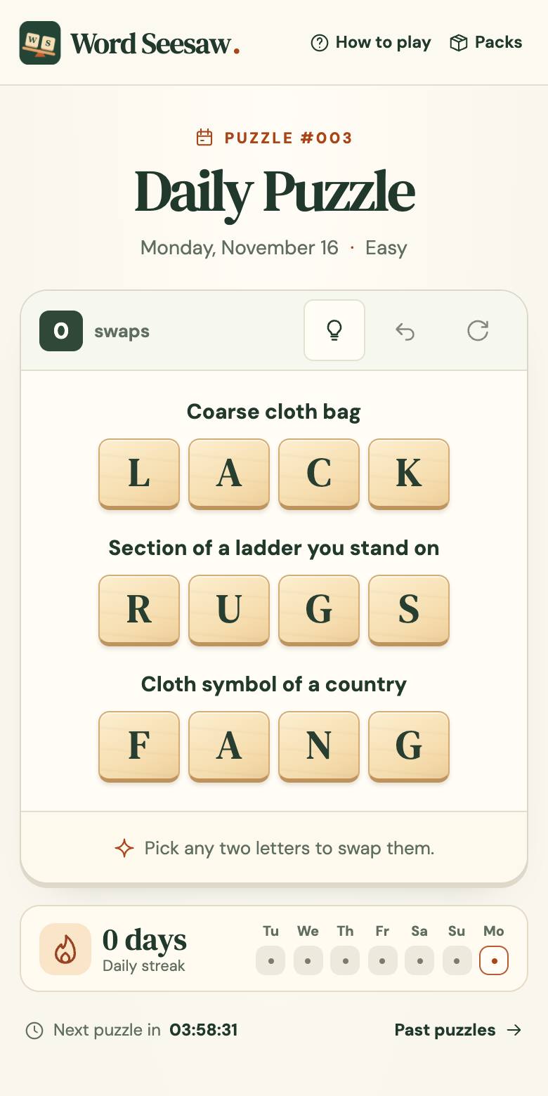
- The browser opens your site at 390×780 and tries your main path by tapping.
- When something blocks it, the report shows exactly what covered what.
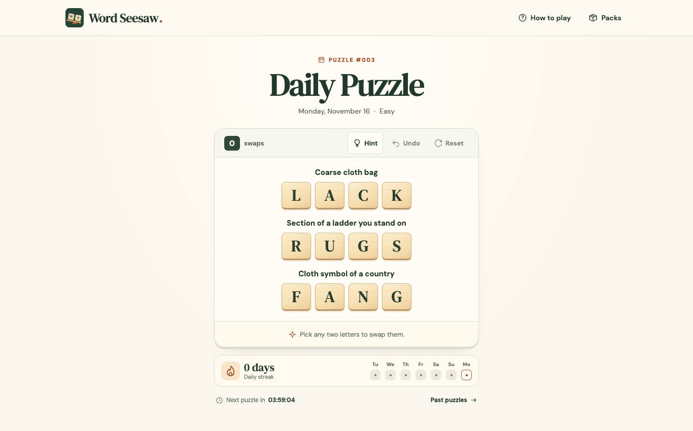
- It also checks desktop, so you see both side by side.
Questions
Is this a real phone?
It's a phone-sized screen in a desktop browser, which catches layout and navigation problems. Reports say so.
Which phone sizes?
390×780, a common modern phone width, plus a 1366×850 desktop.
Can you test my app store app?
No, only websites and web apps reachable in a browser.